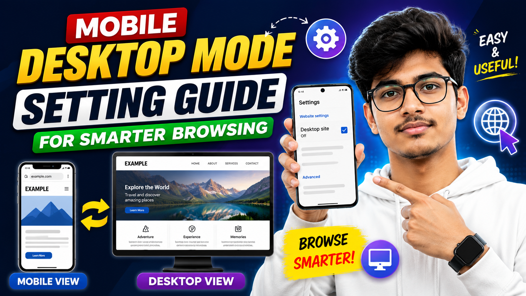
Hello friends, today we are going to try something useful with this topic. Many people open a website on their phone and see half content missing, buttons hidden, or menus that do not work properly. Often the solution is not a different app, it is a small browser option called desktop mode that is slightly hidden inside the more setting menu.
This blog will help you understand what the mobile desktop mode setting actually does, how to use it in Chrome and other browsers, and when it is better to stay in normal mobile view. We will walk through clear steps, give real examples, and also show some common mistakes that slow down phones or break pages.
The guide is for anyone who uses a smartphone to visit banking sites, college portals, office dashboards, blogging platforms, or any web tool that is designed mainly for laptops. If you ever saw a message that said use a desktop browser or you could not find a button that your friend saw on a computer, this guide is for you.

Most modern browsers hide this option under a three dot more button or a similar menu. You do not need any special app, but you should know where the setting lives on your device and what it can and cannot fix. We will also compare how popular browsers handle desktop mode so you can pick the one that matches your daily use.
Related Resource
The Download Now button above opens the Google Play page related to Mobile desktop more setting. Tap it to reach the app install page directly, so you can open the listing without searching again.

What Is Mobile Desktop Mode Setting
On a phone, desktop mode is a request to the website to send the same layout it would show on a laptop screen. The browser pretends to be a desktop browser and usually loads the full version of the page instead of the simplified mobile design.
This setting does not turn your phone into a real computer. The screen size is still small, and your mobile processor and RAM are unchanged. It only changes how the site is displayed and sometimes what features the site decides to show.
In many Android browsers the option is called desktop site. In some others it is written as request desktop site or desktop mode. All of these refer to the same idea.
How To Enable Desktop Mode In Popular Mobile Browsers
Google Chrome on Android
Chrome is the default browser on many Android phones, so we start here.
- Open Chrome and go to the website you want to view.
- Tap the three dot more icon at the top right corner.
- In the menu, find the option named desktop site.
- Tap the check box next to it. The page will reload in desktop view.
If you want every tab to open this way, open the more menu on a blank tab and turn on desktop site before browsing any pages. Chrome will try to keep this preference for new tabs, though it can reset after updates or cache clear.
Samsung Internet
- Open Samsung Internet and visit a web page.
- Tap the three line or three dot more button at the bottom or top, depending on your version.
- Select desktop site from the list.
Samsung Internet sometimes handles zoom better in desktop mode compared to Chrome, which can help on large phones.
Mozilla Firefox on Android
- Open Firefox and load the target website.
- Tap the three dot more menu in the address bar.
- Tap desktop site to toggle it on. The icon may change color when active.
Firefox usually remembers this setting per tab. Once you close the tab, you may need to enable desktop mode again in the next one.
Typical Workaround On iPhone
On Safari, tap the aA icon in the address bar, then choose request desktop website. Other iOS browsers follow a similar pattern, but exact labels can change with updates.
When Desktop Mode Actually Helps
Desktop view is not needed for every site. It shines in some special situations where the mobile layout hides important tools or uses a very strict limited design.
Example 1, College or office portal
Many university and company portals are designed first for laptop screens. On mobile, users often report missing sidebars, time table links, or export buttons. Turning on desktop mode can reveal panels and drop down menus that were hidden in the mobile layout.
Example 2, Blog or website admin panel
WordPress, Blogger, and other content management tools often show only basic controls in mobile view. When you enable desktop mode, you may see the full editor, widget settings, and plugin panels that look similar to your laptop view. This is useful if you need to edit a menu or change a theme quickly from your phone.
Example 3, Full table or chart view
Healthcare portals, stock chart sites, and analytics dashboards often use wide tables. Mobile view tries to stack them, which sometimes cuts columns or makes scrolling painful. Desktop mode usually keeps the original table width so you can pinch to zoom and see the full row at once.
Desktop Mode Vs Mobile View, Practical Comparison
The table below shows realistic differences between staying in mobile layout and using desktop mode on a phone.
| Feature | Mobile View | Desktop Mode |
|---|---|---|
| Layout fit on screen | Optimized for small screens, larger text and buttons | Wide layout, needs more zoom and horizontal scroll |
| Feature access | Sometimes limited, some advanced options hidden | Usually full feature set similar to laptop view |
| Data usage | Usually lighter pages, fewer heavy scripts | Often heavier, large images and scripts loaded |
| Performance on budget phones | Generally smoother | Can lag, freeze, or reload tabs |
| Ease of reading | Better for long articles | Text often small, needs frequent zoom |
| Form filling and buttons | Touch friendly controls | Small buttons, more chance of wrong taps |
Common Mistakes With Mobile Desktop Mode Setting
Many users keep desktop mode always on, thinking they are getting a richer internet. This can silently create problems over time, especially on older or low memory phones.
- Always forced desktop view Some sites have well made mobile pages. Forcing desktop can break login boxes or video players that were tuned for touch controls.
- Heavy battery and data use Desktop pages can load big background images and complex scripts. On mobile data or when roaming, this wastes both battery and money.
- Accessibility issues Very small text and tight menus are harder for anyone with weaker eyesight or larger fingers. Mobile layouts normally solve this.
- Confusion during troubleshooting If a form does not submit, support teams often assume you are using normal mobile mode. Forgetting that desktop mode is on can make debugging slow.
Case Study, Small Business Owner Using Desktop Mode Smartly
Consider a small business owner who runs an online shop from a mid range Android phone. During the day they need quick access to orders and customer messages, often on poor mobile networks. Full desktop view would slow things down too much.
They create a simple routine. For checking new orders, tracking shipments, and replying to chats they stay in mobile view which loads faster and is easier to read in a hurry. Only when they need to change product prices, edit theme code, or export a large report they enable desktop site from the more menu for that one visit.
This mixed approach keeps the phone responsive and battery friendly, yet still gives access to advanced features when needed. It is usually better than a permanent desktop mode that constantly stresses the device.
How To Use Desktop Mode Without Slowing Your Phone
You can build a simple checklist so this setting works for you instead of against you.
- Turn on desktop mode only for specific sites that really need it, such as admin panels and portals.
- After finishing the task, open the more menu again and uncheck desktop site so normal browsing stays light.
- Close heavy tabs in desktop view, especially if you notice stutters or reloading when switching apps.
- On limited data plans, wait until you are on a trusted Wi Fi network before loading very complex dashboards in desktop view.
- If a site looks broken or fonts are too tiny, switch back to mobile layout first and then report any remaining issue.
Conclusion
The mobile desktop mode setting is a simple switch hidden in the more menu of your browser that can rescue you when a site demands a laptop. It reveals full controls, dashboards, and tables that might not appear in compact mobile layouts.
At the same time, using desktop view everywhere can slow down your phone, drain data, and make text harder to read. The most practical approach is to treat it like a special tool, not a default. Turn it on for portals, admin panels, and complex web apps, then turn it off again for normal reading and casual browsing.
If you follow the steps in this guide and build your own routine, you will get the benefit of desktop level features without sacrificing the comfort and speed of mobile optimized sites.
FAQ
Does desktop mode make my phone as powerful as a computer
No, it only changes how the website is displayed. Your hardware and operating system stay the same.
Why does a site still show mobile view even after enabling desktop mode
Some sites ignore the request and force their mobile layout. In that case, no browser setting can fully override it.
Is it safe to use desktop mode for online banking on mobile
If you use the official site in a trusted browser on a secure connection, the mode itself does not reduce security. Use it only when necessary and avoid public Wi Fi for sensitive tasks.
Can I set desktop mode as default for one specific site only
Some browsers remember your last choice per site, others do not. Chrome tends to apply the setting more broadly, while a few third party browsers offer domain based rules. Options may change with updates.
Why do videos or pop ups not work in desktop mode on my phone
Certain video players and pop up scripts are designed for mouse and keyboard. On phones they may not detect touch correctly in the desktop layout. Try returning to mobile view or using the official app if available.
Thank you for reading. If you found this guide helpful, keep visiting our blog for more latest tech news, useful apps, AI tools, and practical mobile tips that make everyday browsing easier.